|
DEMOS & TIPS
|
Watercolor Demonstration"A Kiss Before Fiesta"
By David Cuin
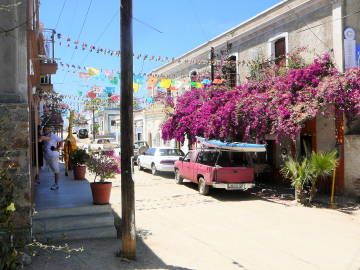
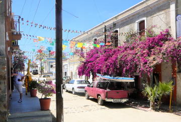
This painting began in a small Mexican town called Todos Santos on the Baja peninsula. I take a lot of photographs for paintings when I'm traveling (digital film is cheap) and most never get beyond the "One day I'll..." stage. I liked the hot street with its festive flags and stunning bougainvillea and caught a furtive kiss in the shadows on the sidewalk. I tend to compose my paintings through the lens of the camera but cameras always lie so there are always adjustments to make before painting
Compositionally, this scene has its problems: is the beautiful bougainvillea the subject or the kissing couple at the left? Its really the stunning flowers but the eye tends always to go to living things in the painting so maybe the couple should be the subject. In the end, I decide to break the guidelines and make the bougainvillea the subject and bury the secondary story in the shadows. I quite like to include detail not immediately apparent until the observer gets closer to a painting or, alternatively, imply some kind of subtext. In this case I run the risk of telling two stories, always dangerous. The green plant at the right is going to be more important than it seems; the color will complement the bougainvillea and help draw the eye to the subject. The fronds must be delicate, they will be sunstruck against the shadows and clumsy shapes will not be skillful. This turns out to be quite a complex painting and its hard to see where it can be simplified much. It will require patience to convincingly indicate the detail. Getting To It
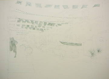
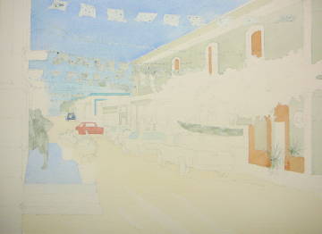
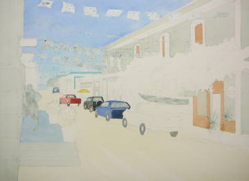
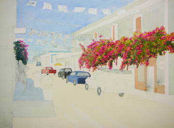
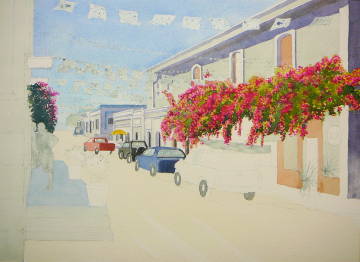
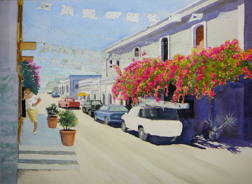
First I need to correct the perspective of the street and buildings in the sketch. The edges of a camera's lens always distort the verticals, especially if the camera is not level when the picture is taken. Of course, the telephone pole has to go and also the confusing giraffe and other items behind the couple. I add an extra row of flags closer to the observer to help establish distance. I plan to emphasize the light in the street by sandwiching it between shadow areas at the left and right. Good darks are going to be particularly important to emphasize the lights. Most of the whites in the building facades will be easy to paint around but complicated areas, like the flags, and places where I want to preserve white paper for highlights or to ensure the brightness of later color need to be masked before painting. I apply masking to the plant on the right with a pen rather than a brush to get thin delicate lines and gesture. (Click on the images to see them a little larger).Painting a watercolor is 50% thought and 50% action. Most people don't realize that. Often I'm asked "Well, how long did it take you to paint that?" The answer isn't easy because I probably began the painting while driving around town How am I going to approach it? What techniques? What are the things to be careful of? What compositional problems are there? I make a start working conventionally from light to dark. I put in a sky with a mixture of Cobalt and Cerulean blues, cooler in the distance. I don't have to worry about the flags as they are masked. I leave out the complex happenings at the end of the street and settle for a simple hill.I apply a very pale yellowish wash to the road and here I lose a couple of opportunities. I should have left the far end of the street white, again to emphasize the light there, and incorporated more dry brush with the white of the paper shining through to simulate the glare of reflected light off the road ... but I didn't. Oh, well! Next I begin to work the initial grey-green washes on the buildings and also use some greyed Burnt Sienna for woodwork in sun. I apply a Cobalt blue wash to the top surface of the sidewalk that seems to reflect the sky. This is an underpainting for the final wash that comes later. I begin to develop the line of cars on the street. I work the vehicles using colors that I choose, rather than the actual ones, in order again to emphasize the whites, working the values on the cars to express their shape and lighting. At the end I will scratch a bit of sparkle on them to show highlights. Most of the cars were white as you see from the reference photo and that would do nothing for the painting. At this stage I leave out the nearest vehicle because I'm unsure what color to make it; I don't really want to repeat one of the other colors. Blue would be lost in the shadows in that area and red would be lost in the bright flowers, yellow would compete for attention. Why not green? Well, I could invent a reason but I just don't think the kind of green used on cars will work. Now I tackle the bougainvillea using Holbein Opera and my usual W&N Permanent Alizarin crimson. I want it really bright. I spritz the paper with water dots before beginning and during the work, protecting other painted areas with my hand, to enhance edge effects by producing some hard and some soft edges. I try to produce sprays of blooms leaving white in between. After drying the work, I apply a mid-value, yellow-green wash between the flowers with New Gamboge and Cobalt blue, charging in a dark green mix of New Gamboge and French Ultramarine while it is wet. Light spritzing was used. All this is a bit tedious but necessary.At this stage, I rather feel I've overdone the redness of the flowers and am not too happy with the result. You should always complete a watercolor, however, because it is often in the later stages that things come together. I'm hoping my darks will counterbalance this overbearing passage. I add a little bougainvillea at the left with cooler colors (it's in the shade) to carry some of the Opera color over; there will be more in the pots on the sidewalk. I start to add some mid-dark shadows with a grayed purple from Alizarin crimson, French Ultramarine and some green to develop dimensionality in the buildings. I also begin to add the doorways that punctuate the very light facade of the buildings on the right. Their darks will help in establishing bright sunlight. I continue to add shadows making the ones under the cars really dark to anchor them down and linking that passage to the shadow under the bougainvillea at the right. I complete the open windows at the second storey with a warm dark from F. Ultramarine, Sepia and a little red, and shadow the closed wood shutter. I pay particular attention to the filigree shadows on the road at right.Removing the masking on the figures at the left, I develop them to completion. I also wash over the pale grey concrete (Cobalt and Burnt Sienna), add the flower pots and plants (taking care not to make them too bright because they are in shade), complete the steps and the balcony projections above remembering to allow for reflected light from the road. I remain uncertain about the color of the pickup truck so I cut out several shapes that approximate the body, paint them different colors and superimpose them on the truck. I make my selection and poll trusted critics also. We all choose the same color one problem solved. Finishing stages
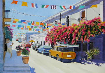
I attack the bougainvillea with water spritz and add Permanent Magenta to cool the flowers and add some dimension to the sprays. After letting this dry, I do the same with the foliage, charging in a very dark green from Prussian blue and Sepia into shadowed areas. This is a substantial improvement. Having the courage to go really dark in parts can often be the making of a painting. I add some windows into the shadowed wall at the right. Now for the shadow over the whole left side. There are difficulties here; it could easily ruin the painting. I don't want it too dark because I want it to recognize the reflected light from across the street and I want it to be luminous but, conversely, I don't want it to be too wimpy or it will not set off the light down the street. Also, the black of the woman's dress that I have already painted is going to bleed if I use too much brush action. Maybe I should have painted that after the shadow but it might look like an afterthought then. Enough, after due thought there comes a time when you just have to go in and do it one bold wash over everything without fiddling. The shadow of the potted plant on the road echoes the filigree shadows at the right. The value turns out a little on the wimpy side but its OK. I make the flowers on the pot plants Opera because I want more of that on the left. Being happy with the color of the truck, I paint it and the kayak on top. I'm not too happy with the drawing of the kayak but its too late to change it now. It is as it was, which is no excuse, it would have looked better oriented more for and aft on the truck. I remove all of the remaining masking and paint the flags a bit stronger in the foreground than down the street to use atmospheric perspective for depth. I opt for quite a lot of yellow/orange to tie in the color of the truck to the balconies on the left. I tint the potted Yucca on the right with very pale green, darker near the center and leave some white on the leaves for sparkle its a nice contrast to the purple shadow, as I intended. Its always nice when something works out.Completing the balcony ironwork, taillights, license plates and hubcaps on the vehicles, I also add telephone poles and wires. Scratching highlights on the sides of the vehicles, I put in a few small figures under the yellow umbrella up the street and in the distance. A Mexican street, even during siesta, isn't entirely devoid of people. Its easy to critique your own work because you know what the vision in your mind's eye was like (and you almost always fall short of that) and you know where things didn't turn out as well as planned so I'm not going to second guess what I've already said. At the end, I found the foreground of the painting unsatisfactory from a compositional viewpoint there was just too much empty road. I tried various croppings no artist likes to sacrifice finished work and eventually cropped a little off each side and quite a lot off the bottom. You can see the difference between the last two illustrations and I think it improves the work. Here's the source photograph again, cropped like the finished painting. It's easy to see the deficiencies in the photograph out of vertical verticals at the edges, sloping steps/sidewalk, confused areas, etc.© 2026 by David Cuin, all rights reserved.
|

